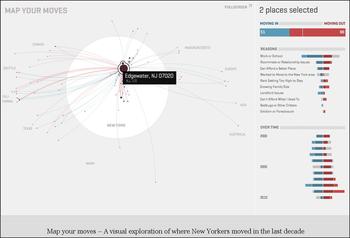
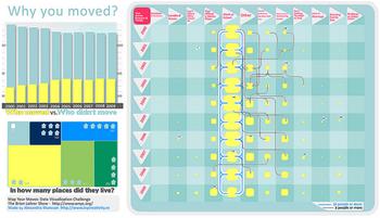
As part of our 10 Questions that Count census project, we asked you to Map Your Moves by filling out a survey where you've lived over the last ten years and why you moved. Then we asked all of you graphic designers, mappers, statisticians or any other kind of data visualization gurus, to play with the data and make the information beautiful. (More information about the Map Your Moves challenge here)
Here are the the submissions we've received. Feel free to add your thoughts below. Any favorites? Learn anything new? Share your feedback!

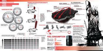
 Bigger Version
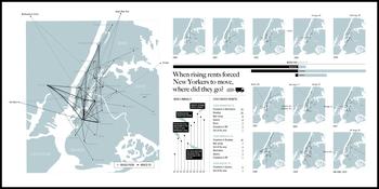

 Bigger Version
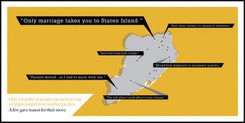
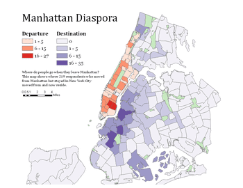
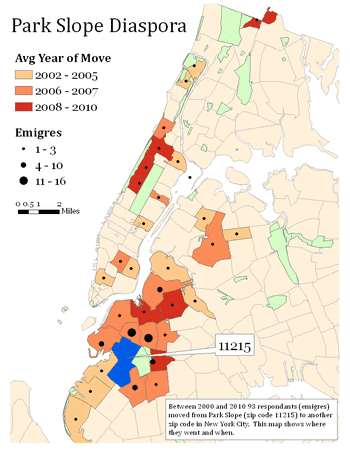
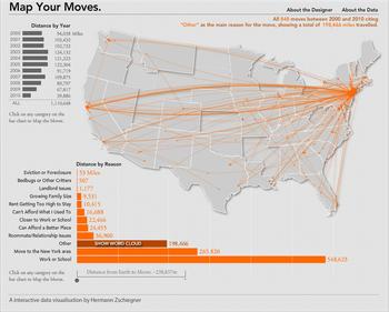
 Flash Version


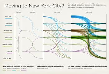
 Career: Graphic Designer/Illustrator
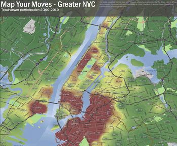
 Download PDF