
When the WNYC Data News Team unwraps a new data set, sometimes there are little lumps of coal inside.
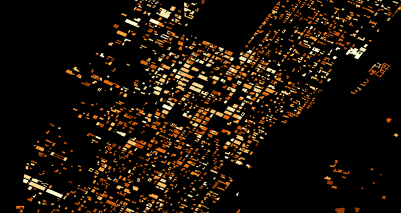
Take the map above, made by WNYC's Noah Veltman, which shows buildings in New York City according to their energy use per square foot.
Chelsea Market jumps out very brightly, as do hospitals on the Upper West Side and Upper East Side. Which makes sense.
But there are lots of dark holes in Manhattan, indicating zero energy use (unlikely) or missing data (yup). And even among the reported numbers, some are suspicious.
“I think that unless they’re enriching uranium in the basement of the Fulton Street mall that their number is probably wrong,” says Veltman. “According to the data they’re using 28-billion BTUs per square foot.”
Issues around missing or improbable numbers are among dozens of problems listed in a new field guide to bad data by Chris Groskopf, a reporter at Quartz and a veteran data journalist.
“You don’t go down the list and treat it like a checklist,” Groskopf says of the guide. By familiarizing yourself with possible problems, he says, “then you start to notice them out in the world.”
Take the number 65,536. Any spreadsheet with that many rows — like a list of planted trees we once received from the city — should set off alarms. That’s because that’s also the maximum number of rows in old versions of Microsoft Excel. So it’s very likely the spreadsheet is missing trees (it was), or whatever list of items you’re viewing.
And then there’s spelling. A dog licenses data set Groskopf once worked on had 250 versions of “Chihuahua.”
While a veterinarian might not care how you spell the breed for Max or Lucy, he says “to anyone who’s trying to work with that data, it’s completely worthless.”
But there’s hope. The Quartz guide to bad data includes tips for how to turn those lumps of coal into useable gems.