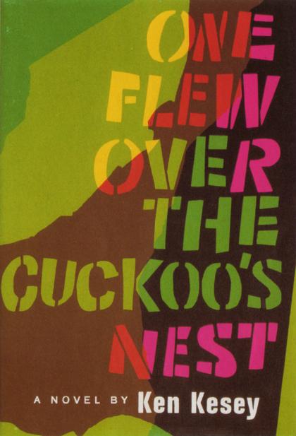
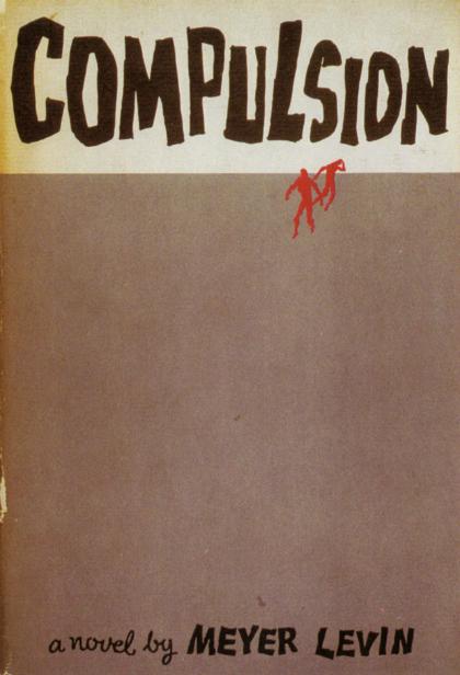
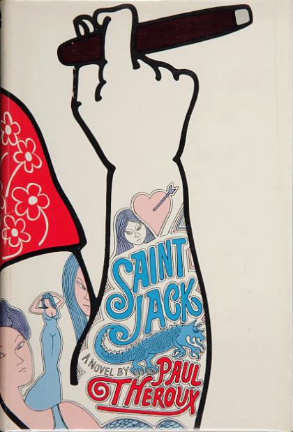
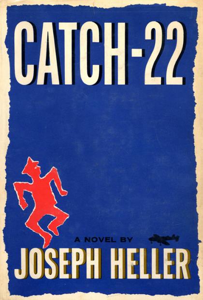
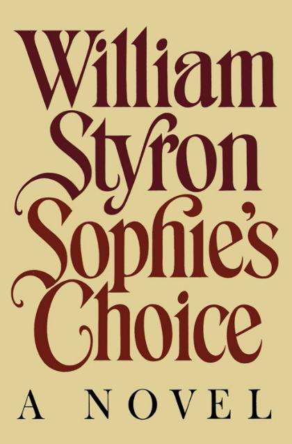
The world of graphic design lost a titan this month. Paul Bacon, who died on June 8 at 91, designed iconic covers for books such as Jaws, One Flew Over the Cuckoo’s Nest, and Catch-22. According to his obituary in the New York Times, Bacon was responsible for what became known as the “big book look,” a widely imitated style that stressed big typography and blocky colors with understated drawings. Bacon saw his job as “finding something that would be a synthesis graphically of what the story was about,” he told Print magazine in 2002. He was one of the best at it, and his work inspired generations of designers like Chip Kidd and Peter Mendelsund.
Bacon hand-drew his designs and much of the typography for the covers, which gave his work a personal, slightly imperfect look. Working with bestsellers meant hearing feedback on his designs from marketing and publicity departments — and doing many revisions. But Bacon wasn’t stubborn. “I’d always tell myself, ‘You’re not the star of the show. The author took three-and-a-half years to write the goddamn thing, and the publisher is spending a fortune on it, so just back off.’” Here are a few of our favorites:
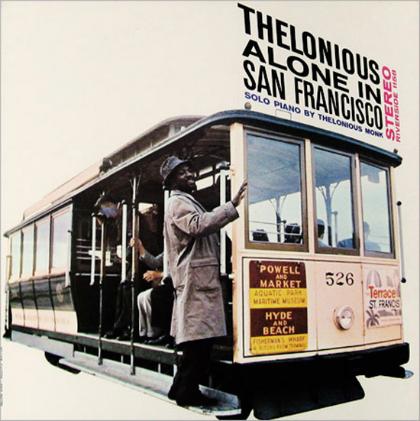
Along with book jackets, Bacon designed album art for jazz labels like Blue Note and Riverside that joined typography and photos in playful, surprising ways.

